Uncategorized, Understanding Audience

NaturALL Club UX Design Project

About This Project

The site focused on in this project is NaturALL Club. NaturALL Club was chosen to be studied and looked into because the site needed a new user experience (UX) design due to the site’s weak user interface (UI), functionality, navigation, and content on the site. There are recommendations for the site to improve that was found by the many different usability tests that were conducted on representative samples of users on the site. To view the full report on this site, click this PDF link.

Recommendations for the Site

The user interface (UI) of the site including the look, design, and location of widgets and the organization of the site should be changed. The font on the website needs to be changed as well as it is not much appealing to some of the users.
Here are a few more recommendations listed down below:

• Change “Our Products” tab to a different name as users are confused with this and the “Our Ingredients” tab
• Create a bigger, noticeable label or pop up screen about shipping costs
• Create more categories instead of categories with a long list of subcategories
• Label the “Hair Quiz” something like “Best Products for Me” as users may not know what the test is

NaturALL Club

NaturALL Club is a natural hair site and e-commerce site where many users can buy products, look at reviews, and connect with others about the products. The company uses safe, non-toxic, and natural ingredients in their products to nourish users’ hair. The users of these products are women, men, and children with kinky and curly hair across the world including African American women and other women of color. The site also allows the users to connect with others on a Facebook community page.

Methods Used

There were multiple methods used to evaluate the user experience, navigation, functionality, and content on the site. Many of the methods are proposed methods as they are not being executed. But, some methods use representative samples of users on the site to make up actual studies. Here are some methods used for this site:

• Competitive Analysis
• Personas and Scenarios
• A Proposed Interview
• Card Sorting Study
• A Proposed Diary Study
• Cognitive Walkthrough
• Usability Testing Session Report

Competitive Analysis

The competitive analysis used in this project was to compare alike sites and gain insights on what the competitive sites were doing. The sites used to compare against NaturALL Club was Cantu, Shea Moisture, and Jane Carter Solution. In the analysis, it is evident that the NaturALL Club site has weaknesses but they have many unique features on their site. Though the sites are different, the competitive analysis allows the company to see what they lack compared to others, their weaknesses, and core features on the site. 

Personas and Scenarios

Three personas were made for the site. A persona is a user-centered design in which one or more fictional characters are made to represent a user type for a brand, site, or product. In the NaturALL Club site, there are a couple of different users who use their products. The three personas depict a young female child, a young adult male, and an older woman. Depicted below are the different users that use the NaturALL Club hair products in the form of a persona. 

Proposed Interview

To gain better insight into users’ needs on the site, there will be an interview with the current users and customers of the site. If this was an actual UX design project the interview created will be used for researchers to conduct but this is a proposed interview that would take place. Some of the interview questions include but not limited to: (Click HERE to see full interview)

  1. Thinking about some of your favorite websites, what do you like about them?
    a. What features do you like the most?
    b. Why do you like these features?
  2. What makes* you want to go to the NaturALL Curl site?
    a. What in particular is interesting about the site?
  3. Tell me about your experience with the site.
    a. Positive?
    b. Negative?
  4. Are you able to find what you are looking for on the site?
    a. (If yes) What makes it easy to find what you are looking for?
    b. (If no) What makes it difficult to find what you are looking for?
  5. What information do you think should be on NaturALL Curly’s site for users to view?
    a. Is there information that shouldn’t be on the site to view?

Proposed Survey

Like the proposed interview, the proposed survey will be used to better understand and learn about the users who use the NaturALL Club site. The answers provided from the users will be anonymous and the information the users give back from the survey will help in better designing the site that caters to the users and their needs. Some of these questions include but not limited to: (Click HERE to see full survey)

  1. What is your age range?
    a. Under 18 years
    b. 18-29 years
    c. 30-49 years
    d. 50-65 years
    e. Over 65 years
  2. What is your gender?
    a. Male
    b. Female
    c. Non-binary
    d. Prefer not to say
  3. How do you purchase NaturALL Club Products? Select all that apply.
    a. Online
    b. In-Store
    c. Other__________
  4. What is your hair type?
    a. 1a – 1c
    b. 2a – 2c
    c. 3a – 3c
    d. 4a – 4c
    e. I don’t know
  5. How long have you used NaturALL Club products?
    a. >1
    b. 1-2 Years
    c. 3-4 Years
    d. 5 Years

Card Sorting Study

Card sorting is a method used for participants in a study to organize topics into categories that make sense to them and can make their own labels for these topics if willing. The card sorting study for this site was an open card sort in which the participants can group cards they saw fit and label the groups themselves. There were three participants in the card sorting study who were each given a set of cards related to the NaturALL Club website. There were 30 cards in total for the participants to sort. (Click HERE to see full analysis) 

Overall, two-thirds of the participants created seven categories for the site for navigation. This is more categories than the site has currently. One participant created categories that are unique and creative for the site that ended in exclamation points. Two-thirds of the participants grouped most of the categories together creating a total of 7 categories each but one participant created four categories.

A similarity matrix was created to see how the participants grouped the cards in similar ways. The other method of analyzing the data was a participant centric analysis which shows three different user responses and how strongly the other participants labeled the groups.

This UX method showed that the NaturALL Club site needs to add more navigation tabs and exciting labels to their site that interest the users.

Proposed Diary Study

A diary study is a form of user research. This is a proposed study for the site if it were in an actual UX design project. As participants are conducting their everyday activities they will fill out a self-report on the activities they are involved in regularly. This will create data about the activities they have done along with the participants’ attitudes and expectations. The questions that the users will answer with this study are: (Click HERE to see full proposed study)

  1. How do users feel about the website design?
  2. How difficult or easy is the site to use?
  3. How and why users are buying products?

The participants of the study will not only be tracking their activity on the NaturALL Club site but tracking their activity on the competitive sites as well. This is to understand how users use natural hair sites and understand their decision making. In the diary study the participants will be answering the questions:

  1. Have you made a purchase of a hair product?
    a. If so, did you visit the company website?
  2. If you bought a hair product from a store, which store was it?
    a. Why did you buy it from the store?
    b. What did you do while you were at the store?
    c. What made you select this product?
  3. What was your goal in shopping and looking for products?
    a. Did you achieve this goal?
  4. What kind of information are you looking for on the site?
    a. Were you able to find the information?
  5. What made the website easy or difficult to navigate?
  6. How much time did you spend on the website?

Cognitive Walkthrough

The last method conducted for this site was a cognitive walkthrough. A cognitive walkthrough is a usability method to find issues in a system. The system here is the website. There was one goal for the users to complete and this was to find products to buy on the NaturALL Club website. There were three steps, visit the website, find the list of products, and buy a product from the site, in place and in each step the users answered the same four questions which were:

  1. Is this what you expected to see?
  2. Are you making progress toward your goal?
  3. What would your next action be?
  4. What would you expect to see next?

Throughout the walkthrough, there was one issue that came about. It was the confusion about where the customer can buy the product. Though the site lists some featured products on the website the person going to the site may or may not interpret the “Shop” widget as a list of the products and some may interpret this as a list of products.
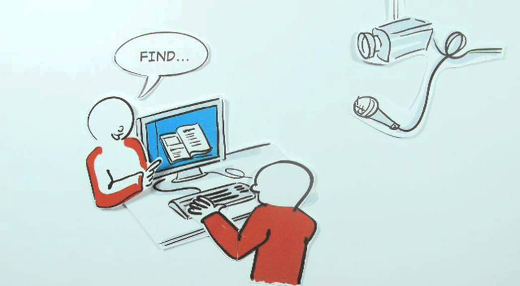
Usability Test

Usability tests are used when a researcher wants to observe users while accomplishing tasks given to them. In this usability test, three participants were given five tasks to do on the NaturALL Club website. The participants were screen recorded and timed for how long they performed each task. Participants used a Mac computer and screen recorded from the Mojave screen recording software. Here is the list of the five tasks given to the participants: (Click HERE to see full analysis)

Task 1: You want to find out how NaturAll Club makes their products and what they have in them. Find out what they put in their products.

Task 2: You don’t have any idea what product to buy because you don’t know what works good on your hair texture. Find on the site where you can find this out.

Task 3: You want to know how much shipping would cost for the products. Find where you can get this information.

Task 4: You want to connect to other people using the same hair products as you online. Find out where you can connect with others.

Task 5: You want a certain product but not sure how others like it. Find out how others like the products.

Here is an example of a user completing the usability test from the screen recording.

The image below shows just how long each participant took to complete the test.

There were a few recommendations from the usability test that the site should change and improve on. When users are looking for what is in the hair products some of them will get confused on two different labels that sound similar to each other. These labels are “Our Products” and “Our Ingredients”. It sounds as though these labels go hand and hand which the participants wondered as to why a section is labeled “Our Products” when there is an “Our Ingredients” tab. “Our Products” should be labeled differently so users aren’t as confused with the two categories.

When users want to find what product works best with their hair they may often find a hard time finding where the tab is. This quiz is very prominent on the home page but all of the users bypassed it. My suggestion is to put this hair quiz at the very top of the home page where users can see it. Or, label the “Take the Quiz” tab with something else like “Best Products For Me” because some users may not know what quiz the site is talking about.

The last recommendation I will give is about the shipping cost. When participants were prompted to find out how much shipping and handling was it was the toughest task to complete. Many of the participants clicked in the shopping cart hoping to find out what the cost of shipping was which they were all wrong. They had to scroll all the way to the bottom of the page to find the shipping cost. I suggest putting a small information bar at the top of the home page informing users of shipping fees. For example, products over $100 get free shipping. This can be advertised on the home page for users to see.

Understanding Audience

Usability Testing

Image result for usability test" Image from https://www.google.com/url?sa=i&url=https%3A%2F%2Fusabilla.com%2Fblog%2F7-must-see-usability-testing-videos%2F&psig=AOvVaw2sypSNGxgLF2DgPEmD697y&ust=1575743257864000&source=images&cd=vfe&ved=0CA0QjhxqFwoTCICD0_vXoeYCFQAAAAAdAAAAABAO

You may or may not have heard of usability testing. But, what exactly is usability testing, you might ask. Usability testing is when researchers observe users who are attempting to complete a task or a set of tasks scenarios with the company or product.

If you have read my previous blog posts from this particular class I have been working on a site called NaturALL Club. I have completed many tests and diagrams for the company which was interesting to complete.

In my usability test, I had three participants to complete the test. The objective for them was to complete five tasks on the NaturALL Club website. These tasks were listed as:

Task 1: You want to find out how NaturAll Club makes their products and what they have in them. Find out what they put in their products.

Task 2: You don’t have any idea what product to buy because you don’t know what works good on your hair texture. Find on the site where you can find this out.

Task 3: You want to know how much shipping would cost for the products. Find where you can get this information.

Task 4: You want to connect to other people using the same hair products as you online. Find out where you can connect with others.

Task 5: You want a certain product but not sure how others like it. Find out how others like the products.

Here is a video of one of the participants completing the tasks.

While the users complete the tasks, I screen recorded each of them from the Mac Mojave screen recording software. Here were the results of the study.

Creating a usability test can tell you a lot about the site you are working on. As users are taking the test researchers can find some problems with the site and or come up with recommendations to better help the website provide to its users. While observing the participants complete the tasks I noticed a couple of problems the site has. I listed out some of the problems which follow:

In task 1, the participants were given the task to find what was in the company’s products. Some of the participants were confused with the tabs labeled “Our Products” and “Our Ingredients”.

For task 2, finding what products works best for the user was challenging for some of the participants. There is a link on the homepage that prompts users to find what product works best for them. All of the users skipped past this and went to look for it in the navigation toolbar.

In task 3, finding the shipping cost was the challenge for all 3 participants. They all looked everywhere but couldn’t find it. At some point, each participant decided to look deeper into the site and scroll all the way to the bottom which was their last option.

After discussing the problems with the site, I came up with some recommendations the site can use to better it for their users. Here were these recommendations.

As I have found problems during the usability test, I recommend some areas to improve the site. When users are looking for what is in the hair products some of them will get confused on two different labels that sound similar to each other. These labels are “Our Products” and “Our Ingredients”. It sounds as though these labels go hand and hand which the participants wondered as to why a section is labeled “Our Products” when there is an “Our Ingredients” tab. “Our Products” should be labeled differently so users aren’t as confused with the two categories.

When users want to find what product works best with their hair they may often find a hard time finding where the tab is. This quiz is very prominent on the home page but all of the users bypassed it. My suggestion is to put this hair quiz at the very top of the home page where users can see it. Or, label the “Take the Quiz” tab with something else like “Best Products For Me” because some users may not know what quiz the site is talking about.

The last recommendation I will give is about the shipping cost. When participants were prompted to find out how much shipping and handling was it was the toughest task to complete. Many of the participants clicked in the shopping cart hoping to find out what the cost of shipping was which they were all wrong. They had to scroll to the bottom of the page to find the shipping cost. I suggest putting a small information bar at the top of the home page informing users of shipping fees. For example, products over $100 get free shipping. This can be advertised on the home page for users to see.

If you want to understand how your users navigate your site and potentially find problems with it, I suggest creating a usability test for the users to complete. This will give a lot of information about your site and what you can potentially fix.

Understanding Audience

Emoticon Score Method

Image result for emoticon survey"

Emoticons are very popular among people who use them on their mobile phones, tablets, and other devices. Not only are emoticons great for texting friends and expressing how one feels to others but emoticons can be used as a method to understanding how users feel about something.

Many of the emoticons are being used in surveys and questionnaires for users and participants to take. Down below is a picture of what the emoticons can look like.

Image result for emoticon survey"

Some ways that UX companies try or have tried to measure emotions is by using biometrics like eye tracking, facial analysis, skin sensors, and voice analysis. It is known to be very expensive and time-intensive to measure each case that they experiment with. IDX@ Pratt explains that using a self-reporting type of data can be meaningful if the right tools are used for users to record their feelings and emotional state.

While surveys can be great for companies and businesses to distribute it can often be time-consuming and may be too long for users who are taking it. Because attention spans today are very short many people choose to opt-out of surveys. This is what IDX@Pratt states is a “survey fatigue”. A company HappyOrNot was created in 2010 in Finland to make the survey’s easier for users about feelings. Their mission is “Happiness in every business, worldwide”.

So, what exactly does this company do? This company has created physical pushbuttons with 4 different emoticons for customers to push to let a business know how they feel or how their experience was either positively or negatively. Many businesses can put this in front of their doors as customers are walking out. Here is an example below.

From my own experience, I have used a HappyOrNot emotion stand in my college cafeteria and have pressed the buttons many times to give my feedback to them.

Many retailers and big places like airports have tested the HappyOrNot device which users simply answer the question “are you happy or not”. In 2016 the London Southend Airport placed this in the airport for passengers to push. They’ve had over 1.5 million responses of smiley faces since putting the HappyOrNot device up. The smiley face system was also used in the Greater Columbus Convention Center in which they installed them in each of their 50 bathrooms. Surprisingly, they had collected over 500,000 points in data in one year from the system.

Using this user experience method is very useful to companies. Not only can you use a HappyOrNot device but you can also do this electronically. Companies can make a one-question survey with this emoji sentiment survey and get responses immediately on how people feel about the business or company or an aspect of the company. A company can increase its user experience by getting users to complete the emoticon score survey.

If you run a business, non-profit or organization I would consider using this method to get useful feedback on users’ feelings. Investing in the HappyOrNot device can also help your company get feedback from the users in whichever area they are in the building.

Understanding Audience

Interviews and Surveys

Image result for survey free image"
Image from https://www.bluleadz.com/blog/10-of-the-greatest-free-survey-tools-you-should-try

Interviews and surveys are both critical in understanding users. Both forms of data collection can help and aid in knowing how the users feel and what they think and know about a product or service. You may have created some interview questions or surveys yourself for individuals to take but how do you know if they are good enough for the person to take the survey? In this post, I am going to enlighten you on what interviews and surveys are and provide you with important information that I think you should know about these data collection methods in a shortened post.

Mostly everyone has taken a survey at some time in their life. According to the authors of Understanding Your Audience, a great way to use a survey is when there is “a brand-new product or a new version of a product” (266). A person completing this survey will tell the designers if the product or service is great or bad or give constructive criticism to the designers. Surveys can also be effective in getting information from a large sample of people in a short amount of time. Creating a survey can be difficult or easy depending on what kind of data you want to collect. The most common survey type is by web but some designers or companies also do telephone surveys. 

So, what should you look out for when creating surveys? Here is a list and a description of them below. 

• Selection Bias– Choosing people like your family, friends, and colleagues that have already signed up for surveys may not give accurate data because they are considered convenient samples. 

• Nonresponse Bias– Some people that you may target for your surveys may not want to take the survey you are giving for many reasons. But to improve the response rate you can personalize the survey for the individual keep the survey short, make it easy to fill out, and offer an incentive for the individual.

While making a survey you always want to make questions clear for the person taking it and make sure the respondent can answer the question. You will want to avoid loaded questions and questions that are built on assumptions. Survey questions can also be open-ended but you don’t want too many open-ended questions as the respondent may not want to answer too many where they have to write. Take a look at a survey I have created for NaturALL Club users!

Interviews are great for capturing in-depth responses to questions and better understanding the users. An interview can consist of both the designer asking the questions and the interviewee. Sometimes observers can watch the interview from another room. There are some critical steps you need to take before setting up an interview. 

You will need to come up with the questions first, which I hope you will need to conduct an interview. You can then create an activity proposal for what will happen during the interview and get the interview proposal reviewed by stakeholders of the company. Then, you can recruit and identifying users, prepare the materials for the interview location, incentives, consent forms, and anything else important you will need for the interview. After this, you can conduct a pilot interview with some colleagues and make changes to the interview questions. The day before the interview you can remind the participant and stakeholders (who can observe) about the interview. On the day of, you will need to set up the location with the materials you need to conduct the interview. 

There are three types of interviews you can conduct which I will list below. 

 Unstructured– This is an interview where it will feel more like a conversation between the two individuals. The interview will have open-ended questions for the respondent to answer. The interviewer can also go off topic about the question a bit to understand more about what the responded meant by something they said. 

• Structured- This is more of an interview that is controlled and tends to only have closed-ended responses where the interviewee must pick from a list. This may feel like a survey but participants can add a bit more of what they want to say in the interview. 

• Semi-Structured– This can be a combination of both unstructured and structured interviews. The interview isn’t exactly like an unstructured conversational approach but the respondent can say what they feel. 

Interview questions should be clear for the respondent and the questions should be kept short and no longer than 20 words. There is also a way you should go about conducting your interview. It should start with an ice breaker, an introduction, the body of the interview where the questions will be asked, a summary of the interview, and a wrap-up. I also created an interview for NaturALL Club website for you to check out and better understand how an interview should go!

Understanding Audience

Five Whys Analysis

Image result for question free image"

If you have ever been around young children you would know they ask a ton of questions. The famous question a child may ask is “why is the sky blue” and you answer. But, they don’t stop there. They question that answer with a “why” and repeats it until you have run out of answers. Though the child may or may not know what they are doing they are getting to the bottom of the answer. 

There is a name for asking “why” several times. It is called the Five Whys Analysis. The Five Whys Analysis specializes in getting to the root of the problem and fast. According to mindtools.com, they mention that deeper issues are the cause of recurrent and stubborn problems which can be fixed quickly but that may not solve the real cause of the problem. Trying to quickly fix an issue results in possibly more issues. 

As I have stated, the Five Whys Analysis or 5Y is used to get to the bottom of an issue or problem and “reveal its underlying causes” (mindtools). I will explain what the Five Whys Analysis is but here is a video of what it is from MindTools. 

So how did the Five Whys Technique come about? Well, you may be as shocked as I was. Sakichi Toyoda, who was the founder of Toyota Industries, inventor and Japanese industrialist came up with the technique in the 1930s. The Toyota industry still uses the Five Whys Technique to solve problems today but it didn’t get popular until the 1970s. A common phrase and philosophy that Toyota had was “go and see” which meant to understand what was happening in the shop. Their decision making was based on this and it helped see what was happening other than thinking what was happening. 

So when do we use the Five Whys method? According to Mind Tools, you can use the technique “for troubleshooting, quality improvement, and problem-solving, but it is most effective when used to resolve simple or moderately difficult problems”. Using this technique to solve a complex question or issue may not be your best bet due to multiple causes of what the issue can be. For complex types of problems, MindTools suggests using methods like the Cause and Effect Analysis or the Failure Mode and Effects Analysis. 

This technique is very simple to use when trying to find the root of a problem. For example, if you suggest a more efficient tool for your co-workers to use and they aren’t using it you may want to use the Five Whys Technique. But, how? 

Using the example I gave above you must first start by bringing your co-workers together to go over the issue. The second step is defining the problem. In this case, the problem is “Co-workers are not using the most effective tool to do the job”. You can place the question on a whiteboard but leave some room for more writing as you will also answer to the “why” questions. From there, you can ask the first “why” question to the problem. It will look somewhat like this. 

Answering this question may take some people a while to come up with an answer but this is a start. The coworkers may even come up with several answers to the question. The next step is asking “why” four more times. Sometimes you may not use that many “whys” to get to the bottom of the problem. Here is the rest of this problem and its solution down below. 

As you can see in the example picture, I have gotten to the bottom of why the co-workers were not using the most effective tool. There can be many solutions to this. You can set a day and time for training for your co-workers or provide them with links to understand the tool you want them to use. 

There is a lot that people have taken from the Toyota Motor Corporation. They used this method to problem solve which repeating “why: five times will make the problem and solution clear to people. This method is used widely to help many people solve problems and get a better understanding of why the problem persists. 

There is a research study where a company used the Five Why analysis or what they call root cause problem solving (RCPS) to reduce scrap losses. They have found that while using this method they identified the problem and came up with an approach “that not only reduces but also eliminates defects” (Murugaiah 2010). The company found that they can eliminate waste with zero-cost. 

Another research study used the method to improve patient safety in the Veterans Health Administration. They used the method by investigating an event to find the cause of the problem they had and prevented reoccurrence. The problem was patients falling and they tried to investigate medication errors and so on. By using the method, they came up with solutions to prevent these things from happening. 

When trying to come up with solutions to a problem I would suggest using the Five Whys method for the best results.


References:

https://www.mindtools.com/pages/article/newTMC_5W.htm

https://www.emerald.com/insight/content/doi/10.1108/02656711011043517/full/html

https://www.jointcommissionjournal.com/article/S1549-3741(03)29052-3/abstract